Helsinki Tourist Analysis
In this post a open dataset was used to find the correlation between tourist visiting Helsinki and factors affecting it
The Helsingin tilastollinen vuosikirja 2017 was chosen from https://hri.fi/en_gb/, for finding interesting trends in the data. The data set was divided into different categories and each category consisted of several tables. These tables contain available data since 1995 to 2016. To find good relationships between the data, different tables of different categories were inspected individually and some good statistics were chosen from tables (i.e: mean, standard deviation and percentage increase/ decrease). The tables were than merged to get a better understanding of overall data trends. In second step pair of interesting categories were selected for further evaluation. The selected two tables were, the ‘Number of visitors at prominent tourist attractions in Helsinki’ from “Culture and leisure” category and “Sunshine and rainfall” from “Area and surroundings” category. There was some missing data in the tables for some years. This missing data was replaced by mean of the available data. The table for ‘Number of visitors’ included places which were both indoor and outdoor. So, to check the relationship between number of visitors and climate, 3 top outdoor tourist attractions; namely Linnanmäki, Suomenlinna and Korkeasaari were selected. The Graph below shows the relationship between the two datasets
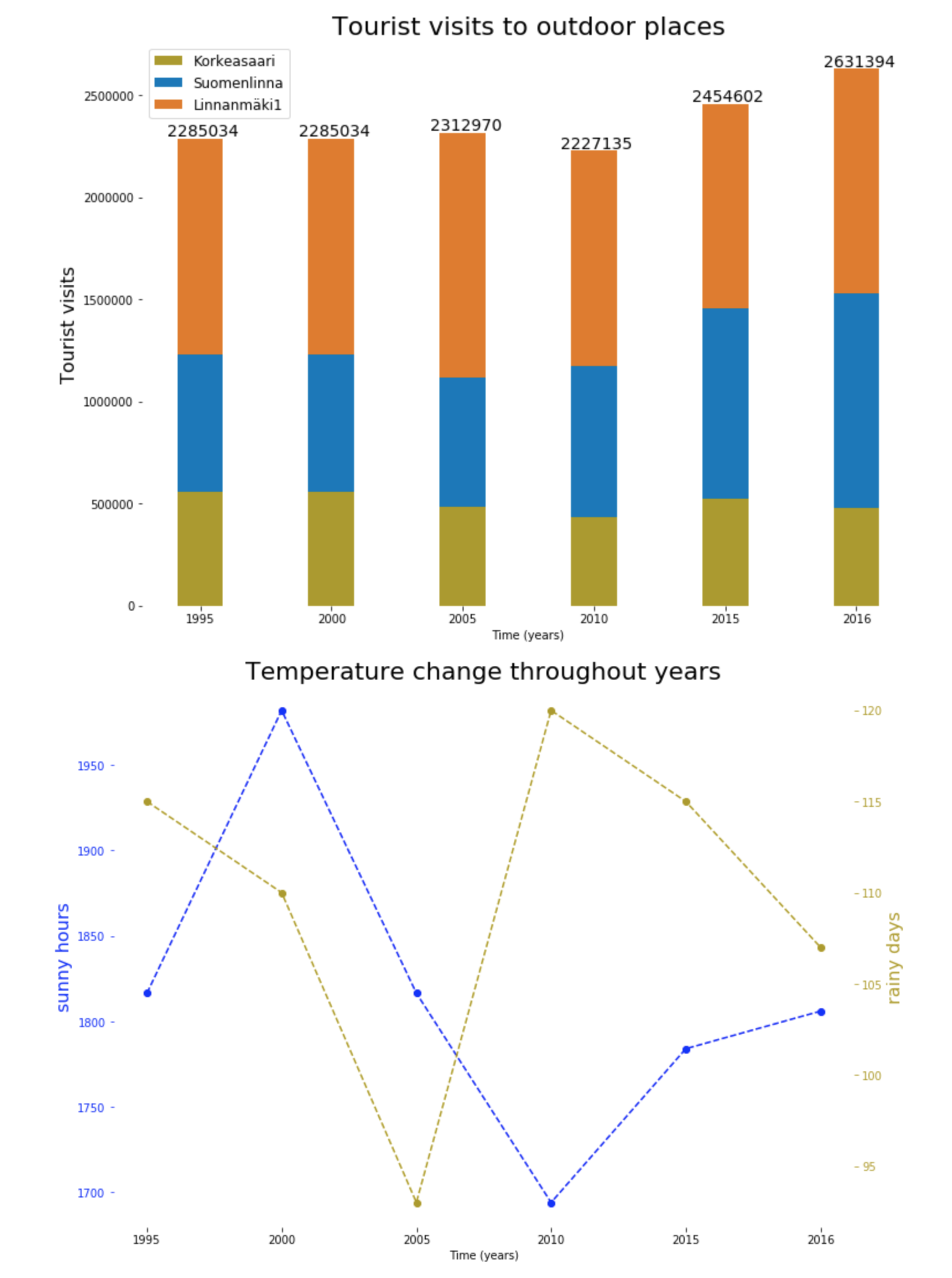
The graphs plotted, show that there was a gradual increase in visitors for above mentioned location from 1995 to 2005. This could be correlated with less rainy days in those years. However, there was a decrease observed in the amount of visitors in 2010. This could be caused by increase in rainy days from 90 to 120; almost a month; and decrease in number of sunny hours, which hit its lowest around 1700 that year. After 2010 there has been an increase in number of visitors. One of the factors influencing this increase could be the climate; after 2010 the amount of rainy days started to decrease, whereas there is a rise in sunny hours.
There were two types of data structures available in the selected data. The table for ‘Number of visitors at prominent tourist attractions in Helsinki’ had data for different locations for each year. Whereas “sunshine and rainfall” provided the climate data for each year. The main objective of the graphs was, to provide user with appropriate graphics. So by finding the correlation between two datasets, they can compare the change in visitors amount and the climate. Visitors dataset was the primary dataset and supportive reasoning was required to explain the changes in the amount of visitors using climate dataset. The comparison of individual values for each year was required for the visitors dataset. So the bar graph was selected to clearly show transition between the values of total visitors in Helsinki for each year. On the other hand, we needed to show the trend changes in the climate, that is why point graph was used.
The point graph consisted of two datasets namely rainy days in a year and sunny hours in a year. The major problem encountered while plotting was to show these two datasets on a single point plot. To overcome this problem both left and right axis were used to show different scales for each datasets. Different colors were used to distinguish between the data points of two datasets, whereas dashed line was used to show the trend of data through the years. To improve the data ink ratio of the graph, the grids were not used. Furthermore, the axis lines from all the four sides of the graph were removed, only ticks for left, right and bottom axis are visible to the reader. The font size of the labels for the axis were selected of appropriate size, so that they are clearly visible to the reader. To further improve the readability of the graph, the ratio of the graph was set to 1:1.3, which is close to the golden ration of 1:1.618. The time series was set as x-axis, as horizontal axis is easier to read and detect changes. Furthermore, the colors used were of different contrast, so that user could distinguish between the two trends easily. The color range to represent the data in the graph was specifically selected to avoiding the color blind range.
The bar graph consists of time series data. The main purpose of the bar graph is to allow reader to compare the total number of visitors in Helsinki for several years and observe a trend. To encode the additional information about different outdoor places a stacked bar graph is used. This would allow the reader to have some idea about the proportion of visitors in different places for specific year. The stacked bar graph could create ambiguity in the trend analysis and could make it hard for reader to understand the overall trend of the data. To help reader overcome this trouble the total amount of visitors is displayed on top of each bar. The advantage of stacked bar graph over separate bars is that, stacked bar graph allows the reader to easily recognize the change in total visitors. Whereas, if individual bar graphs were used, it would have been difficult. To improve the data-ink ratio same techniques are used as mentioned in the previous paragraph, however, some additional ink is used to show the total number of visitors on top of every bar. Furthermore, contrasting colors were used between the stacks to make it easier for user to distinguish between boundaries of consecutive regions.
The graphs were optimized to show the provided data as clearly as possible to the reader, minimizing the ambiguities for reader, making it easier to observe the trend. However, it was felt that several other factors could have been responsible for this increase in the visitors amount. These factors, could have been studied and presented. Furthermore, extra work could be done to find some good common axis between the data, so that it could be represented in one graph.
The code base for project could be found here